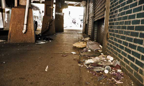
-
Commercial
- commercial: 100
- views: 3735
- comments: 135
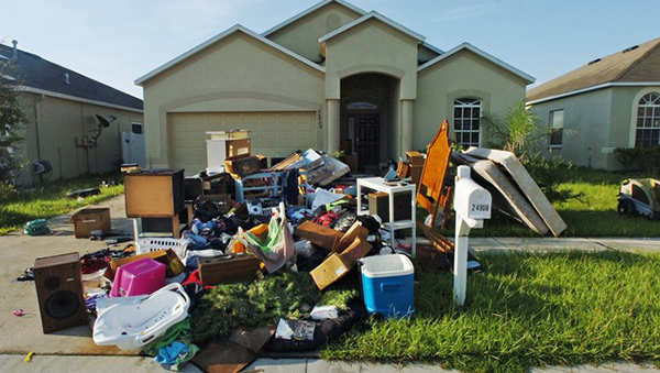
-
Residential
- residential: 200
- views: 3001
- comments: 140
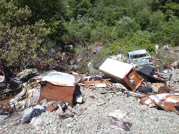
-
Hills Side
- hill side: 25
- views: 375
- comments: 85

-
Metals
- metal: 100
- views: 254
- comments: 59
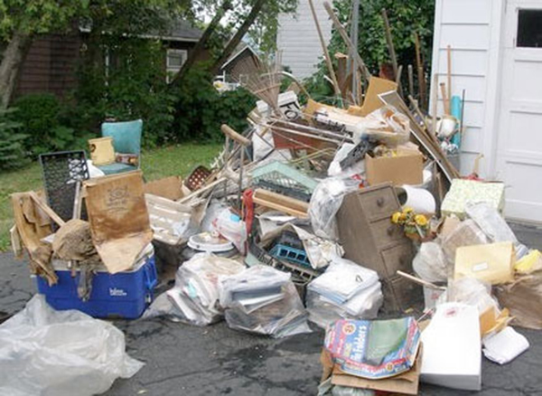
We do all kinds of Residential Trash / Junk Removal Services. Call us now.
Read more...

We do all kinds of Commercial Trash / Junk Removal Services. Call us now.
Read more...
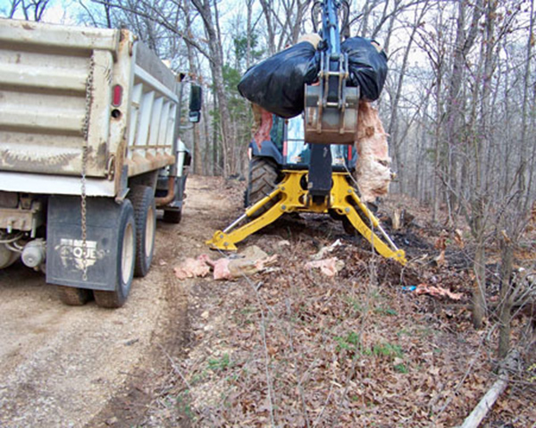
We do all kinds of Hills Side Trash / Junk Removal Services. Call us now.
Read more...
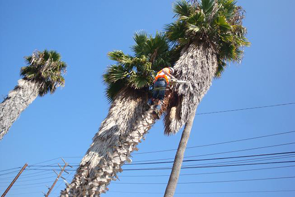
We do all kinds of Metal / Tree Trash / Junk Removal Services. Call us now.
Read more...
Design & Features
Typography
JSN Epic was developed with extreme focus on typography and we believe it provides the most comprehensive content presentation capability. Headings, text, links, tables, images, everything was designed with high level of refinement. Let's take a look.
Headings
This is an H1 Header
Lorem ipsum dolor sit amet consectetuer eleifend elit vel tellus laoreet. At ut pellentesque risus quis sem eros et consequat enim lorem. Aenean lorem consequat consequat eu.
This is an H2 Header
Lorem ipsum dolor sit amet consectetuer eleifend elit vel tellus laoreet. At ut pellentesque risus quis sem eros et consequat enim lorem. Aenean lorem consequat consequat eu.
This is an H3 Header
Lorem ipsum dolor sit amet consectetuer eleifend elit vel tellus laoreet. At ut pellentesque risus quis sem eros et consequat enim lorem. Aenean lorem consequat consequat eu.
This is an H4 Header
Lorem ipsum dolor sit amet consectetuer eleifend elit vel tellus laoreet. At ut pellentesque risus quis sem eros et consequat enim lorem. Aenean lorem consequat consequat eu.
This is an H5 Header
Lorem ipsum dolor sit amet consectetuer eleifend elit vel tellus laoreet. At ut pellentesque risus quis sem eros et consequat enim lorem. Aenean lorem consequat consequat eu.
This is an H6 Header
Lorem ipsum dolor sit amet consectetuer eleifend elit vel tellus laoreet. At ut pellentesque risus quis sem eros et consequat enim lorem. Aenean lorem consequat consequat eu.
Text columns
You can arrange content in multiple columns by using very simple html code. JSN Epic will detect the amount of columns you defined and automatically make arrangement.
Usage: <div class=”grid-layout”><div>Text in column 1</div><div>Text in column 2</div></div>
Content arranged in 2 columns
Text column
Lorem ipsum dolor sit amet consectetuer eleifend elit vel tellus laoreet. At ut pellentesque risus quis sem eros et consequat enim lorem. Aenean lorem consequat consequat eu.
Text column
Lorem ipsum dolor sit amet consectetuer eleifend elit vel tellus laoreet. At ut pellentesque risus quis sem eros et consequat enim lorem. Aenean lorem consequat consequat eu.
Content arranged in 3 columns
Text column
Lorem ipsum dolor sit amet consectetuer eleifend elit vel tellus laoreet. At ut pellentesque risus quis sem eros et consequat enim lorem. Aenean lorem consequat consequat eu.
Text column
Lorem ipsum dolor sit amet consectetuer eleifend elit vel tellus laoreet. At ut pellentesque risus quis sem eros et consequat enim lorem. Aenean lorem consequat consequat eu.
Text column
Lorem ipsum dolor sit amet consectetuer eleifend elit vel tellus laoreet. At ut pellentesque risus quis sem eros et consequat enim lorem. Aenean lorem consequat consequat eu.
Content arranged in 4 columns
Text column
At ut pellentesque risus quis sem eros et consequat enim lorem. Aenean lorem consequat consequat eu.
Text column
At ut pellentesque risus quis sem eros et consequat enim lorem. Aenean lorem consequat consequat eu.
Text column
At ut pellentesque risus quis sem eros et consequat enim lorem. Aenean lorem consequat consequat eu.
Text column
At ut pellentesque risus quis sem eros et consequat enim lorem. Aenean lorem consequat consequat eu.
Content arranged in 5 columns
Text column
Lorem ipsum dolor sit amet consectetuer eleifend elit vel tellus laoreet.
Text column
Lorem ipsum dolor sit amet consectetuer eleifend elit vel tellus laoreet.
Text column
Lorem ipsum dolor sit amet consectetuer eleifend elit vel tellus laoreet.
Text column
Lorem ipsum dolor sit amet consectetuer eleifend elit vel tellus laoreet.
Text column
Lorem ipsum dolor sit amet consectetuer eleifend elit vel tellus laoreet.
Text styles
Preformatted text (<pre> tag)
#ja-rightcol {
 width: 180px;
 float: right;
 color: #EEEEEE;
}
Quote text (<blockquote> tag)
You can us this style to quote somebody's speech, idea or a fragment from some book, articles, etc. Lorem ipsum dolor sit amet consectetuer eleifend elit vel tellus laoreet. At ut pellentesque risus quis sem eros et consequat enim lorem. Aenean lorem consequat consequat eu.
Usage: <blockquote>This is your quote</blockquote>
Drop Cap
You can use this special drop cap symbol style for magazine / newspaper text paragraph. Lorem ipsum dolor sit amet consectetuer eleifend elit vel tellus laoreet. At ut pellentesque risus quis sem eros et consequat enim lorem. Aenean lorem consequat consequat eu.
Usage: <p class="text-dropcap">This is the text with dropcap symbol.</p>
Highlighted Text
You can use this style to highlight important words and / or keyword expression in search result page. Lorem ipsum dolor sit amet consectetuer eleifend elit vel tellus laoreet. At ut pellentesque risus quis sem eros et consequat enim lorem. Aenean lorem consequat consequat eu.
Usage: <span class="text-highlight">This is the text to be highlighted.</span>
Highlighted Text on mouse over
You can use this style to highlight important text block on mouse over. Just roll mouse over this text block to see how it's highlighted.
Usage: <div class="text-box-highlight">This is the text to be highlighted.</div>
You can use this style to highlight important text block on mouse over. Just roll mouse over this text block to see how it's highlighted.
Usage: <div class="text-box-highlight">This is the text to be highlighted.</div>
Alert Text
You can use this style for alert or warning text paragraph requiring user's attention. At ut pellentesque risus quis sem eros et consequat enim lorem. Aenean lorem consequat consequat eu.
Usage: <p class="text-alert">This is text that requires user's attentions.</p>
Info Text
You can use this style for regular information text paragraph that does not require much user's attentions. At ut pellentesque risus quis sem eros et consequat enim lorem. Aenean lorem consequat consequat eu.
Usage: <p class="text-info">This is your d text.</p>
Download Text
You can use this style for information text paragraph related to download process. At ut pellentesque risus quis sem eros et consequat enim lorem. Aenean lorem consequat consequat eu.
Usage: <p class="text-download">This is download related text.</p>
Tip Text
You can use this style for useful information like tips, hint or help text. At ut pellentesque risus quis sem eros et consequat enim lorem. Aenean lorem consequat consequat eu.
Usage: <p class="text-tip">This is yourtip hint or help text.</p>
Comment Text
Attachment Text
Video Text
You can use this style for description text paragraph that related to video file. At ut pellentesque risus quis sem eros et consequat enim lorem. Aenean lorem consequat consequat eu.
Usage: <p class="text-video">This is your video related text.</p>
Audio Text
You can use this style for description text paragraph related to audio file. At ut pellentesque risus quis sem eros et consequat enim lorem. Aenean lorem consequat consequat eu.
Usage: <p class="text-audio">This is your audio related text.</p>
Link Styles
Link Icon Styles
You can attach up to 20 predefined icons to the front of any link by adding simple class to it.
Usage: <a class="link-icon jsn-icon-xxx">This is link text.</a>, where xxx is the name of icon to be applied. Detailed information about all icon names can be found in template documentation.
Example: <a class="link-icon jsn-icon-download">This is link to download something.</a>
Link Button Styles
JSN Epic offers 6 button styles to decorate any call-to-action links you have in the content.
Usage: <a class="link-button button-xxx">This is link text.</a>, where xxx is the button color name selected from: light, dark, green, orange, blue and red.
Example: <a class="link-button button-orange">See plans & pricing.</a>
Combination of Button and Icon Styles
You can use both button and icon link style combined.
Usage: <a class="link-button button-xxx"><span class="link-icon jsn-icon-yyy">This is link text.</span></a>, where xxx and yyy are button color and icon names respectively.
Example: <a class="link-button button-green"><span class="link-icon jsn-icon-cart">Add to cart.</span></a>
Extension link styles
JSN Epic is able to attach not only descriptive icon to the front of link as described in above section, but also 23 extension icons to the end of the link.
All icons can be assigned automatically by enabling a template parameter or manually by adding simple class to the link.
Usage: <a class="link-icon-ext jsn-icon-ext-xxx">This is link text.</a>, where xxx is the icon name. Detailed information about all icon names can be found in template documentation.
Table Styles
Plain Rows table style
| Table header | Column header 1 | Column header 2 | Column header 3 |
|---|---|---|---|
| Table footer | Footer data | ||
| Row header 1 | Lorem ipsum | Dolor sit amet | Lorem ipsum |
| Row header 1 | Lorem ipsum | Dolor sit amet | Lorem ipsum |
| Row header 1 | Lorem ipsum | Dolor sit amet | Lorem ipsum |
| Row header 1 | Lorem ipsum | Dolor sit amet | Lorem ipsum |
| Row header 1 | Lorem ipsum | Dolor sit amet | Lorem ipsum |
Color Stripes table style
| Table header | Column header 1 | Column header 2 | Column header 3 |
|---|---|---|---|
| Table footer | Footer data | ||
| Row header 1 | Lorem ipsum | Dolor sit amet | Lorem ipsum |
| Row header 1 | Lorem ipsum | Dolor sit amet | Lorem ipsum |
| Row header 1 | Lorem ipsum | Dolor sit amet | Lorem ipsum |
| Row header 1 | Lorem ipsum | Dolor sit amet | Lorem ipsum |
| Row header 1 | Lorem ipsum | Dolor sit amet | Lorem ipsum |
Grey Stripes table style
| Table header | Column header 1 | Column header 2 | Column header 3 |
|---|---|---|---|
| Table footer | Footer data | ||
| Row header 1 | Lorem ipsum | Dolor sit amet | Lorem ipsum |
| Row header 1 | Lorem ipsum | Dolor sit amet | Lorem ipsum |
| Row header 1 | Lorem ipsum | Dolor sit amet | Lorem ipsum |
| Row header 1 | Lorem ipsum | Dolor sit amet | Lorem ipsum |
| Row header 1 | Lorem ipsum | Dolor sit amet | Lorem ipsum |
List styles
Standard list styles
Unordered list
- Lorem ipsum dolor sit amet
- Consetetur sadipscing elitr
- Sed diam voluptua
Ordered list
- Lorem ipsum dolor sit amet
- Consetetur sadipscing elitr
- Sed diam voluptua
Arrow list styles
Red arrow
- Lorem ipsum dolor sit amet
- Consetetur sadipscing elitr
- Sed diam voluptua
Blue arrow
- Lorem ipsum dolor sit amet
- Consetetur sadipscing elitr
- Sed diam voluptua
Green arrow
- Lorem ipsum dolor sit amet
- Consetetur sadipscing elitr
- Sed diam voluptua
Icon list styles
Article icon list
Folder icon list
Image icon list
Online icon list
Star icon list
User icon list
You can assign any of predefined 20 icons to list items. 6 icons shown above are just samples.
Number list styles
Blue Bullet number list
- Lorem ipsum dolor sit amet
- Consetetur sadipscing elitr
- Sed diam voluptua
Green Bullet number list
- Lorem ipsum dolor sit amet
- Consetetur sadipscing elitr
- Sed diam voluptua
Grey Bullet number list
- Lorem ipsum dolor sit amet
- Consetetur sadipscing elitr
- Sed diam voluptua
Orange Bullet number list
- Lorem ipsum dolor sit amet
- Consetetur sadipscing elitr
- Sed diam voluptua
Red Bullet number list
- Lorem ipsum dolor sit amet
- Consetetur sadipscing elitr
- Sed diam voluptua
Violet Bullet number list
- Lorem ipsum dolor sit amet
- Consetetur sadipscing elitr
- Sed diam voluptua
Blue Digit number list
- Lorem ipsum dolor sit amet
- Consetetur sadipscing elitr
- Sed diam voluptua
Green Digit number list
- Lorem ipsum dolor sit amet
- Consetetur sadipscing elitr
- Sed diam voluptua
Grey Digit number list
- Lorem ipsum dolor sit amet
- Consetetur sadipscing elitr
- Sed diam voluptua
Orange Digit number list
- Lorem ipsum dolor sit amet
- Consetetur sadipscing elitr
- Sed diam voluptua
Red Digit number list
- Lorem ipsum dolor sit amet
- Consetetur sadipscing elitr
- Sed diam voluptua
Violet Digit number list
- Lorem ipsum dolor sit amet
- Consetetur sadipscing elitr
- Sed diam voluptua
Module Styles
JSN Neon provides 6 box designs for module background styling, which can be combined with 20 predefined icons for module title styling. Take a look around to see how module styles are applied.
Module styles are configured by module's parameter Module Class Suffix with very simple syntax. To set up icons, you need to add string icon-xxx to module class suffix, where xxx is the icon name.
Layout
Module Positions
JSN Neon provides 37+ module positions allowing you to have multiple layout configurations. All module positions are collapsible which means if you don't publish any modules in some positions it will not take any blank spaces leaving those for neighbor modules. Some positions are designed to arrange modules inside in horizontal layout which makes it very easy to reorder modules inside it.
Layout Configuration

JSN Neon allows you to change the width size for several critical layout elements. All settings can be done via template parameters in section LAYOUT SETTINGS.
Layout Variations
JSN Neon layout system is very flexible and capable. Module positions are designed in smart way to cover all possible spot where you might want to put content. Moreover, you can specify width of both overall layout and specific columns conveniently via template parameters. Bellow is live presentation of some most popular layout variations:
Menu Styles
JSN Neon provides 5 menu styles to present your website navigation. The default Joomla! built-in menu module (mod_mainmenu) is utilized, so you don't need to install any external menu modules.
Top Menu
![]()
Top Menu allows you to arrange menu items in horizontal line and assign icons to them. All icons are configured directly in menu item settings page which is very convenient.
Main Menu

Main Menu is very powerful menu built with clean accessible XHTML code structure and effective drop-down submenu panels.
Main Menu with icons and rich text
![]()
You can add icon and descriptive text to each menu item to make them much clearer and more appealing. Both descriptive text and icons are configured directly in menu item settings page, which is very convenient.
Side Menu

Side Menu is very unique vertical menu with slide-out panels. This menu is extremely efficient when you have complex navigation with a lot of menu items.
Tree Menu

Tree Menu represents menu items in clear tree-like hierarchy, which is very appropriate for indexing menu. By default all submenu items are collapsed until you select the parent menu item.
Div Menu

Div Menu is simple yet nice menu bar with items separated by slightly visible dashes. This menu is very suitable for footer navigation presentation.
JSN Neon Design
JSN Neon has incredibly beautiful clean design with ultra flexible layout built-up from 36+ module positions. The combination of 6 colors variation, 5 menu styles and 6 module styles results in a really remarkable website. In addition, super rich typography makes your content look stunning and clear for all users.
Layout
37+ module positions allowing you to have multiple layout configurations. All module positions are collapsible and can arrange modules in horizontal or vertical layout.
Menu Styles
5 menu styles to display your website navigation on multiple positions. The built-in menu module is utilized, so you don't need to install any external menu modules.
Module Styles
JSN Neon provides 6 background designs, which can be combined with 20 predefined icons for outstading module styling. Make your modules look good easily!
All Trash Removal | Junk Removal, Los Angeles
- All Trash Removal | Junk Removal, Agoura Hills
- All Trash Removal | Junk Removal, Alhambra
- All Trash Removal | Junk Removal, Altadena
- All Trash Removal | Junk Removal, Arcadia
- All Trash Removal | Junk Removal, Avalon
- All Trash Removal | Junk Removal, Baldwin Park
- All Trash Removal | Junk Removal, Bel Air
- All Trash Removal | Junk Removal, Bell
- All Trash Removal | Junk Removal, Bell Gardens
- All Trash Removal | Junk Removal, Bellflower
- All Trash Removal | Junk Removal, Beverly Hills
- All Trash Removal | Junk Removal, Burbank
- All Trash Removal | Junk Removal, Buena Park
- All Trash Removal | Junk Removal, Calabasas
- All Trash Removal | Junk Removal, Canoga Park
- All Trash Removal | Junk Removal, Canyon Country
- All Trash Removal | Junk Removal, Carson
- All Trash Removal | Junk Removal, Castaic
- All Trash Removal | Junk Removal, Century City
- All Trash Removal | Junk Removal, Cerritos
- All Trash Removal | Junk Removal, Chatsworth
- All Trash Removal | Junk Removal, City Of Industry
- All Trash Removal | Junk Removal, Commerce
- All Trash Removal | Junk Removal, Compton
- All Trash Removal | Junk Removal, Culver City
- All Trash Removal | Junk Removal, Downey
- All Trash Removal | Junk Removal, Eagle Rock
- All Trash Removal | Junk Removal, East Los Angeles
- All Trash Removal | Junk Removal, El Monte
- All Trash Removal | Junk Removal, El Segundo
- All Trash Removal | Junk Removal, Encino
- All Trash Removal | Junk Removal, Gardena
- All Trash Removal | Junk Removal, Glendale
- All Trash Removal | Junk Removal, Hawthorne
- All Trash Removal | Junk Removal, Hermosa Beach
- All Trash Removal | Junk Removal, Huntington
- All Trash Removal | Junk Removal, Huntington Park
- All Trash Removal | Junk Removal, Inglewood
- All Trash Removal | Junk Removal, Irwindale
- All Trash Removal | Junk Removal, La Canada Flintridge
- All Trash Removal | Junk Removal, La Crescenta
- All Trash Removal | Junk Removal, La Puente
- All Trash Removal | Junk Removal, Laguna Hills
- All Trash Removal | Junk Removal, Lakewood
- All Trash Removal | Junk Removal, Lancaster
- All Trash Removal | Junk Removal, Lawndale
- All Trash Removal | Junk Removal, Lomita
- All Trash Removal | Junk Removal, Los Angeles
- All Trash Removal | Junk Removal, Lynwood
- All Trash Removal | Junk Removal, Malibu
- All Trash Removal | Junk Removal, Manhattan Beach
- All Trash Removal | Junk Removal, Marina Del Rey
- All Trash Removal | Junk Removal, Maywood
- All Trash Removal | Junk Removal, Melrose - Firefax
- All Trash Removal | Junk Removal, Mission Hills
- All Trash Removal | Junk Removal, Monrovia
All Trash Removal | Junk Removal, Los Angeles
- All Trash Removal | Junk Removal, Montebello
- All Trash Removal | Junk Removal, Monterey Park
- All Trash Removal | Junk Removal, Montrose
- All Trash Removal | Junk Removal, Newhall
- All Trash Removal | Junk Removal, Norwalk
- All Trash Removal | Junk Removal, North Hollywood
- All Trash Removal | Junk Removal, Northridge
- All Trash Removal | Junk Removal, Palmdale
- All Trash Removal | Junk Removal, Palos Verdes Estates
- All Trash Removal | Junk Removal, Palos Verdes Peninsula
- All Trash Removal | Junk Removal, Paramount
- All Trash Removal | Junk Removal, Pasadena
- All Trash Removal | Junk Removal, Pico Rivera
- All Trash Removal | Junk Removal, Porter Ranch
- All Trash Removal | Junk Removal, Ranch Palos Verdes
- All Trash Removal | Junk Removal, Rancho Santa Margarita
- All Trash Removal | Junk Removal, Redondo Beach
- All Trash Removal | Junk Removal, Reseda
- All Trash Removal | Junk Removal, Rolling Hills Estates
- All Trash Removal | Junk Removal, Rosemead
- All Trash Removal | Junk Removal, San Fernando
- All Trash Removal | Junk Removal, San Fernando Valley
- All Trash Removal | Junk Removal, San Gabriel
- All Trash Removal | Junk Removal, San Marino
- All Trash Removal | Junk Removal, San Pedro
- All Trash Removal | Junk Removal, Santa Clarita
- All Trash Removal | Junk Removal, Santa Fe Springs
- All Trash Removal | Junk Removal, Santa Monica
- All Trash Removal | Junk Removal, Simi Valley
- All Trash Removal | Junk Removal, South El Monte
- All Trash Removal | Junk Removal, South Gate
- All Trash Removal | Junk Removal, South Pasadena
- All Trash Removal | Junk Removal, Stevenson Ranch
- All Trash Removal | Junk Removal, Studio City
- All Trash Removal | Junk Removal, Sylmar
- All Trash Removal | Junk Removal, Temple City
- All Trash Removal | Junk Removal, Thousand Oaks
- All Trash Removal | Junk Removal, Toluca Lake
- All Trash Removal | Junk Removal, Topanga
- All Trash Removal | Junk Removal, Torrance
- All Trash Removal | Junk Removal, Universal City
- All Trash Removal | Junk Removal, Valley Glen
- All Trash Removal | Junk Removal, Valley Village
- All Trash Removal | Junk Removal, Valencia
- All Trash Removal | Junk Removal, West Hollywood
- All Trash Removal | Junk Removal, West LA
- All Trash Removal | Junk Removal, Los Angeles
- All Trash Removal | Junk Removal, Westlake Village
- All Trash Removal | Junk Removal, Westwood
- All Trash Removal | Junk Removal, Whittier
- All Trash Removal | Junk Removal, Willow Brook
- All Trash Removal | Junk Removal, West Hills
- All Trash Removal | Junk Removal, Wilmington
- All Trash Removal | Junk Removal, Woodland Hills
All Trash Removal | Junk Removal, San Fernando Valley
- All Trash Removal | Junk Removal, Arleta
- All Trash Removal | Junk Removal, Burbank
- All Trash Removal | Junk Removal, Bell Canyon
- All Trash Removal | Junk Removal, Calabasas
- All Trash Removal | Junk Removal, Cahuenga Pass
- All Trash Removal | Junk Removal, Canoga Park
- All Trash Removal | Junk Removal, Canyon Country
- All Trash Removal | Junk Removal, Chatsworth
- All Trash Removal | Junk Removal, Encino
- All Trash Removal | Junk Removal, Fallbrook
- All Trash Removal | Junk Removal, Glendale
- All Trash Removal | Junk Removal, Granada Hills
- All Trash Removal | Junk Removal, Hidden Hills
- All Trash Removal | Junk Removal, Lake Balboa
- All Trash Removal | Junk Removal, Mission Hills
- All Trash Removal | Junk Removal, Newhall
- All Trash Removal | Junk Removal, North Hills
- All Trash Removal | Junk Removal, North Hollywood
- All Trash Removal | Junk Removal, Northridge
- All Trash Removal | Junk Removal, Pacoima
- All Trash Removal | Junk Removal, Panorama City
- All Trash Removal | Junk Removal, Porter Ranch
- All Trash Removal | Junk Removal, Reseda
- All Trash Removal | Junk Removal, San Fernando
- All Trash Removal | Junk Removal, San Fernando Valley
- All Trash Removal | Junk Removal, Shadow Hills
- All Trash Removal | Junk Removal, Sherman Oaks
- All Trash Removal | Junk Removal, Studio City
- All Trash Removal | Junk Removal, Sun Valley
- All Trash Removal | Junk Removal, Sunland - Tujunga
- All Trash Removal | Junk Removal, Sylmar
- All Trash Removal | Junk Removal, Tarzana
- All Trash Removal | Junk Removal, Toluca Lake
- All Trash Removal | Junk Removal, Toluca Woods
- All Trash Removal | Junk Removal, Universal City
- All Trash Removal | Junk Removal, Valley Glen
- All Trash Removal | Junk Removal, Valley Village
- All Trash Removal | Junk Removal, Valencia
- All Trash Removal | Junk Removal, Van Nuys
- All Trash Removal | Junk Removal, Stevenson Ranch
- All Trash Removal | Junk Removal, Santa Clarita
- All Trash Removal | Junk Removal, Simi Valley
- All Trash Removal | Junk Removal, West Hills
- All Trash Removal | Junk Removal, Winnetka
- All Trash Removal | Junk Removal, Woodland Hills
Related Services
Residential & Commercial
Hills Clean up
Yards Clean Up
Metal Pickup
Tree Services
Palm Skinning




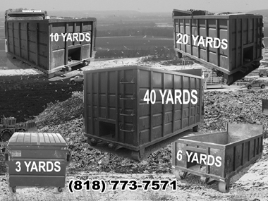


 Put some Information.
 Put Some Information.
 Put Some Information.


You can use this style for comment text paragraph. At ut pellentesque risus quis sem eros et consequat enim lorem. Aenean lorem consequat consequat eu.
Usage: <p class="text-comment">This is your comment text.</p>